

Cambridge Savings Bank
Modernizing an institution
CLIENT
Cambridge Savings Bank
AGENCY
Full Contact Advertising
ROLE
Branding
Brand Strategy
I was contracted by Full Contact Advertising to aid in the rebranding of the oldest institution in Cambridge after Harvard — Cambridge Savings Bank. The team at CSB wanted to refresh their dated branding and design to better represent their current digital efforts and presence while maintaining ties to their legacy and storied past.
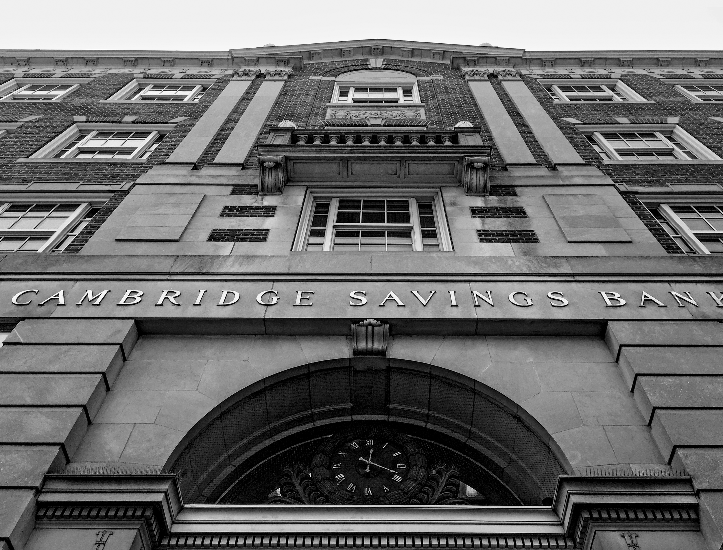
Founded in 1835, Cambridge Savings Bank is the second-oldest institution in Cambridge, Massachusetts after Harvard. Their flagship location, built in 1923, is an emblem of Harvard Square, and to the community at large.
They’ve endured the Great Depression, World Wars, and decades of tales both trying and triumphant. They have evolved into an institution that protects billions of dollars in assets, all the while maintaining a steadfast commitment to their relationships with their clients and community, and their reputation of being trustworthy and accommodating problem solvers.
Discovery
COMPETITION
Cambridge Trust
East Cambridge Savings
Rockland Trust
Brookline Bank
Eastern Bank
Citizens Bank
Santander
KEY TRAITS
Stable
Approachable
Trustworthy
Courteous
Sincere
Reliable
Local
Historic
Innovative
Accommodating
Relational
Cambridge Savings is a local bank that sits smack dab in the middle of an extremely competitive landscape, vying against banks both large and small, in addition to emerging fintech competitors.
CSB's brand presence was very visibly dated, and did not adequately reflect its brand DNA, nor its technological advances and competitive service offerings. They sought Full Contact Advertising (who, in turn, sought me) to aid in the rebrand. The rebrand needed to allow CSB to stand distinctly among the crowd of local banks in the region, reflect its modern digital capacities, and bring the overall aesthetic into the 21st century and beyond.
Quantitative research indicated that among banks local to the Cambridge/Boston area, CSB was rated markedly higher than its competition in characteristics most touted by local banks: stable, approachable, courteous, reliable, trustworthy, smart, and relationship-oriented. We used these traits as guideposts for visual exploration.

During my research phase, I photographed the building, looking for interesting historical and architectural details that could be used to tie to the branding. I found this iron motif on multiple parts of the building, which I used as inspiration for use of the acronym form of the logo, as well as connected lettering. The shape of the building itself was used as inspiration for a containing shape for the lettering – in earlier phases, it was more realistically depicted, and later resulted in a simplified representation of the building ratio.

I sketched an update to the iron detailing and brought the concept into Illustrator for more detailed work.

The letters of the acronym flow together effortlessly, symbolizing connectedness while bridging the legacy of CSB with the future with this modern take on a classic style.


