

K+ Glass
Art meets science
CLIENT
K+ Glass
ROLE
Web Design
Creative Direction
Art Direction
Branding
Brand Strategy
Photography
Copywriting
Rebecca Potash, sole proprietor of K+ Glass approached me for help in developing the creative for her glassblowing business. As one of those unicorn humans brilliantly adept in both science (with a Ph.D in chemistry from Cornell) and art, I knew right off the bat I wanted to play with those dual qualities in her brand.
Rebecca’s last name, Potash, is another term for a potassium salt used to lower the melting point of glass. The atomic symbol for potassium is K, so her chosen moniker, K+ Glass, was a no-brainer. She just needed my help in elevating the design of her brand and website to meet the high level of craft and consideration in her own work.
With glassblowing being quite possibly one of the most captivating artforms (we’re evolutionarily drawn to fire for human survival), I knew her brand design needed to sit back and let the work speak for itself.
Discovery
KEY TRAITS
Smart
Authoritative
Bold
Scientific
Artistic
Serene
In the discovery process, I learned that Rebecca is one of the go-to consultants on anything chemistry/glass-related for the world’s largest glass museum, The Corning Museum of Glass. She possesses a wealth of knowledge on the history and chemical construction of glass and has given a variety of lectures at universities, in addition to her years as a glassblowing instructor on Celebrity Cruises.
Often, this information is quite dense for a casual audience, but casual audiences (and potential customers) don’t understand how complex both the creation of handblown glass and the pricepoint of the materials impact the ultimate product cost. We determined that the best way to create approachable, informative content was through TikTok videos devoted to the science and construction of glass. The goal is to garner more transparency (no pun intended), authority, and of course, sales, but also to create a repository of videos to house on the website in a section called “The Laboratory.” The videos have in fact garnered great interest, with the most successful video reaching upwards of 225k views.

MOODBOARD
Drawing inspiration from the elements (earth/wind/fire/water as well as the scientific elements), vintage science ephemera, art deco, raygun gothic, and surrealist styles, a few particular themes arose that started to guide the design direction—diagonal lines/axis, modernist type, cool color palette.
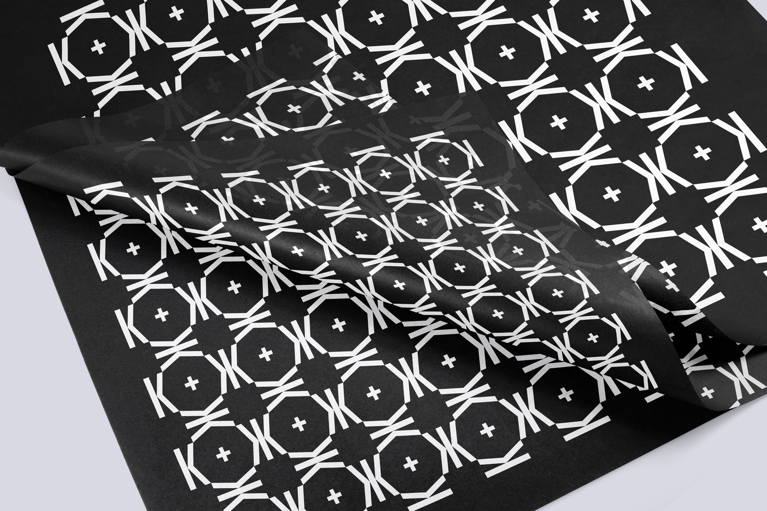
LOGO REHAUL
The K letterform of the new logo was a custom construction. This was done to better balance the forms and proportions within the bounding box.
Using the periodic table placement of the element K as reference, we instated a rule for placement of the K to be on the upper left-hand side of whatever material it appears on.
A smaller logo was created for use in very small scenarios in which the legibility of “Glass” would suffer—the most common being the brand for the bottom of any glassware Rebecca creates.

PALETTE
A cool, dramatic palette reminiscent of the sea (where Rebecca draws most of her inspiration) was selected to sit back and let the color of the product shine.

STATIONERY
Printed materials created to evoke an aesthetic of science/lab books.
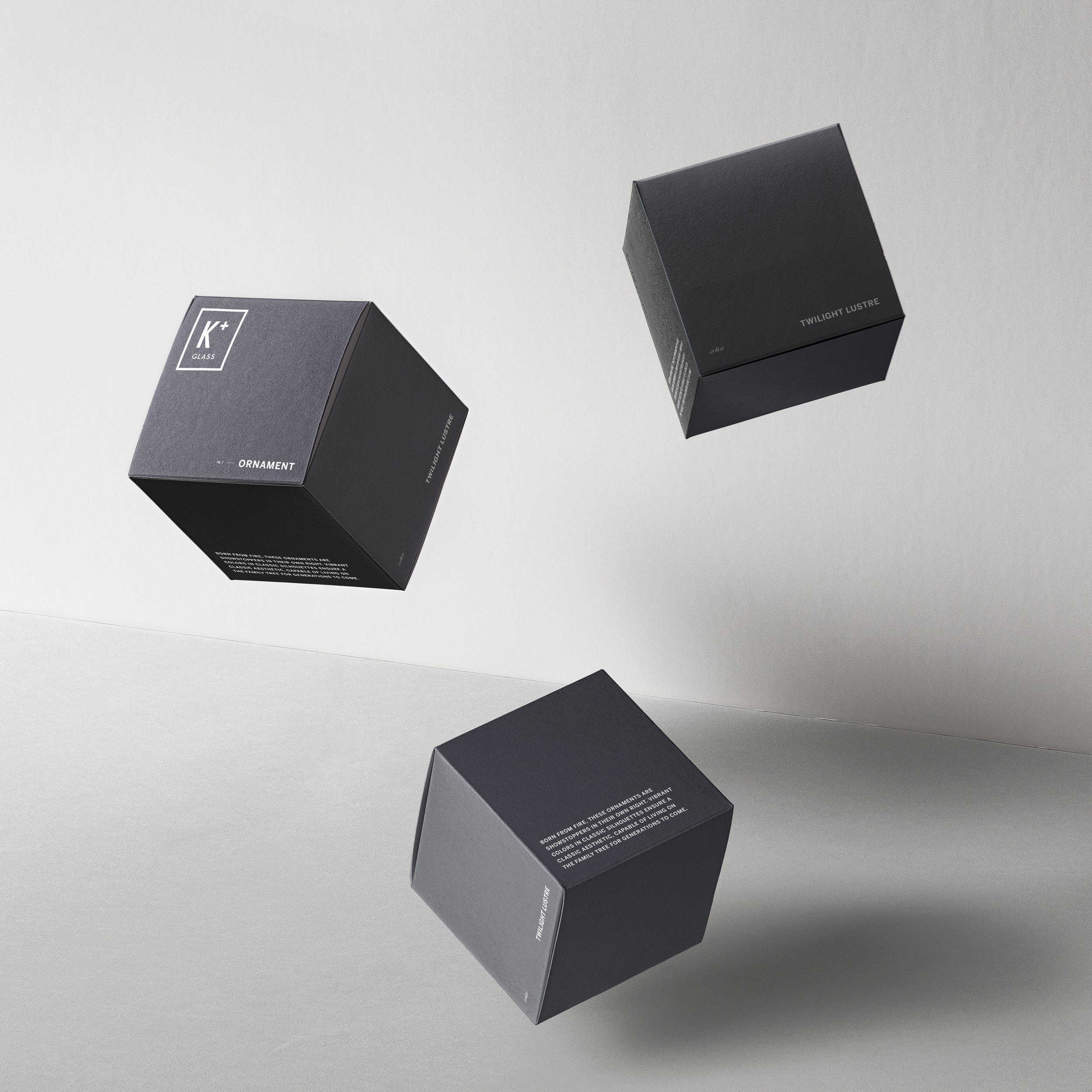
Packaging for ornaments. It was important to be able to clearly feature product color on the box. As a small business owner, Rebecca wanted to be able to build inventory ahead of busy seasons and pre-pack whatever she can for shipments, so when orders start to rush in, fulfillment is as organized and streamlined as possible.
All glass purchases are padded in tissue before being a) fulfilled and shipped online or b) wrapped in front of a customer at a shop, farmer’s market, or pop-up sale. Creating a branded moment here seeks to elevate the unboxing experience for gift recipients or simply the moment before the product joins the home of the purchaser.
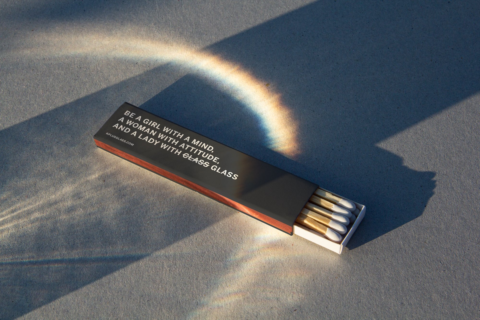
In addition to her business card, Rebecca also wanted a swag item to pack with orders for surprise and delight. A classic matchbox (as fire is the key element in the medium) with a branded idiom was the perfect way to pay this off.


PHOTOGRAPHY
I shot all of the images for site launch, as well as a special drop with partner Slacktide Coffee. The images and placement on social helped sell out the collection in 48 hours—something virtually unheard of in the glass world. More images can be seen here.