
EF / Go Ahead Tours
See the world differently.
CLIENT
EF / Go Ahead Tours
TEAM
GAT Creative
ROLE
Graphic Design
Digital Product Design
UX/UI Design
Art Direction
Creative Direction
Branding
Brand Strategy
Photography
Go Ahead Tours is an experiential travel company with the mission of inspiring and empowering as many people as possible to see the best the world has to offer, effortlessly.
In the four-plus years that I’ve worked here, I’ve designed everything from buses to billboards, catalogs to cookbooks, sweatshirts to sunglasses… I’ve art directed photoshoots, branded global conferences, developed brand and sales campaigns, led a redesign for the website and the brand, photographed our travelers on tour in Spain, France, Italy, Monaco, and India, all the while inspiring and informing past and future travelers, balancing (and exceeding) business goals and ensuring delight at every touchpoint.
I like to believe that I’ve helped to inspire at least a few people to experience the world beyond their comfort zones and maybe return a little happier, a little wiser, and a little more in awe of this magnificent planet and the people they share it with.
Digital Product Evolution
ROLE
UX/UI Design
Digital Product Design
Over the span of a week, a team of about 10–15 people (UX, engineering, copy, marketing) and I were tasked with exploring the 2.0 of the website. Our engineering team wanted to switch to a headless CMS to free up dev time for more strategic projects, and our creative and marketing teams wanted a refresh of the site to position the brand as not just a group tour category leader, but to pave the digital path in the travel industry at large. So the stars aligned and we all worked in a conference room together to hammer out research, competitive analysis, UX, UI, creative direction, and marketing initiatives. It was a whirlwind, but an incredibly productive format I’m grateful to have been a part of.
The site was migrated and shipped within weeks for MVP and has been iterated upon with great success ever since.

BEFORE
This was the prior state of the site. The design was outdated and the CMS was far too manual to update as frequently as needed in such a competitive market.
EXPLORATION

Exploration 1

Exploration 2

Exploration 3
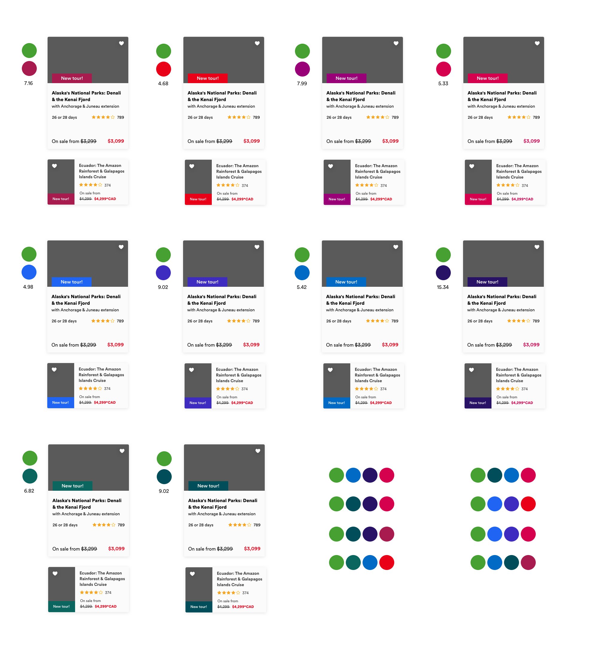
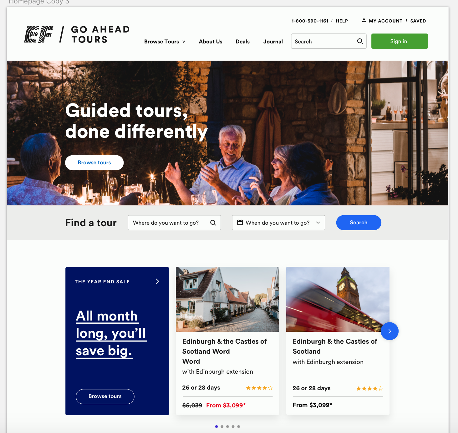
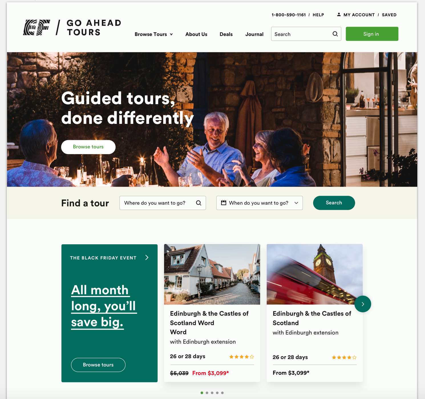
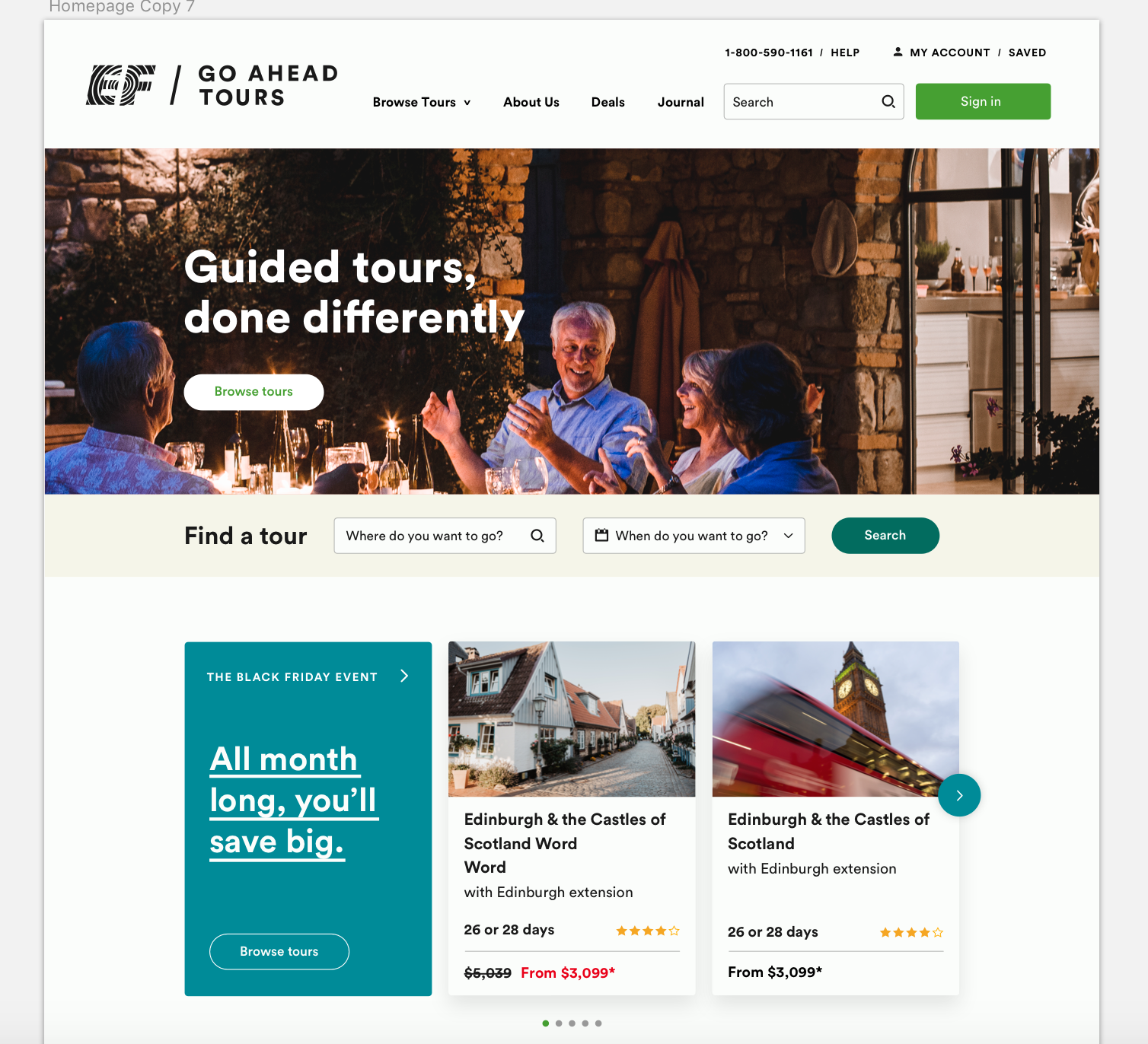
Exploration 3 of my above options ended up being the one that was built (and iterated upon). In our sprint, we discussed many aspects of merchandising, discovery, promotional placement, search, value prop definition, reviews, and types of patterns and components that would be viable and reusable. From there I explored color, accessibility, and how the best options might look on the site.
We ultimately went with a more restrictive color palette, keeping most of the text throughout the site in black, and using a strict palette for component backgrounds.
The site continues to be updated and grows more every day as we’ve built teams dedicated to pre-booking (acquistion & conversion) and post-booking/on-tour (mobile app). But it was from this one-week exercise in a cramped conference room that such vast changes have been implemented in our product and workflow.
Product Discovery Exploration
ROLE
Digital Product Design
For a few months during 2020 when projects were put in a bit of a holding pattern, the UX team and I were tasked with exploring future states of the site. I was asked to look at product discovery. How might we evolve our browse pages to allow for a more organic and immersive discovery of destinations and product?


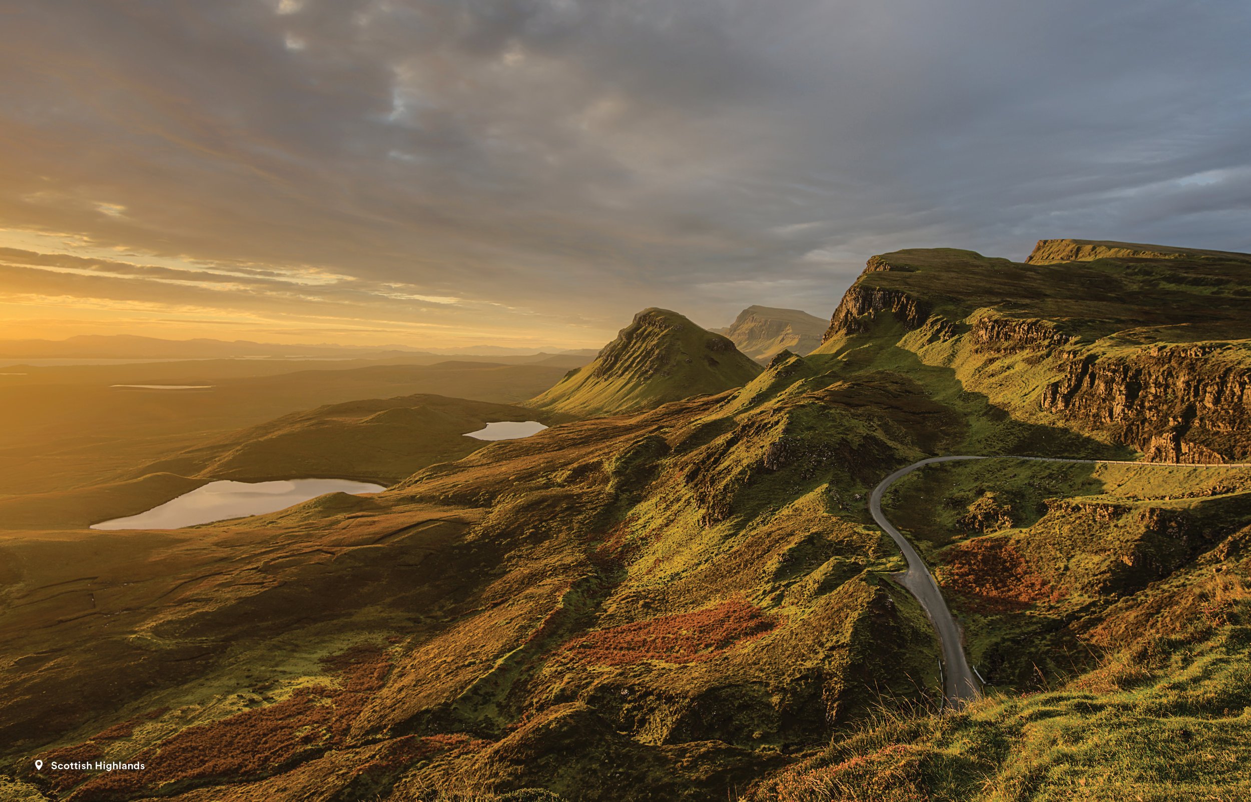
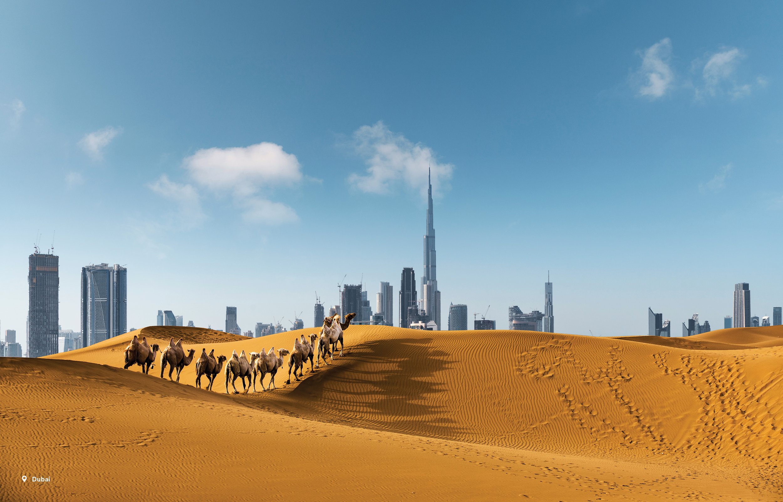
These few options were inspired by the immersive stories like 52 Places as seen on The New York Times. I wanted to bring these destinations to life in a way that incorporated the senses more holistically.


These additional options explored the use of horizontal scroll. The thought was that it could pick up a more traditional timeline format and a means of placing the user in a different mindset for browsing vs. comparing or purchasing.
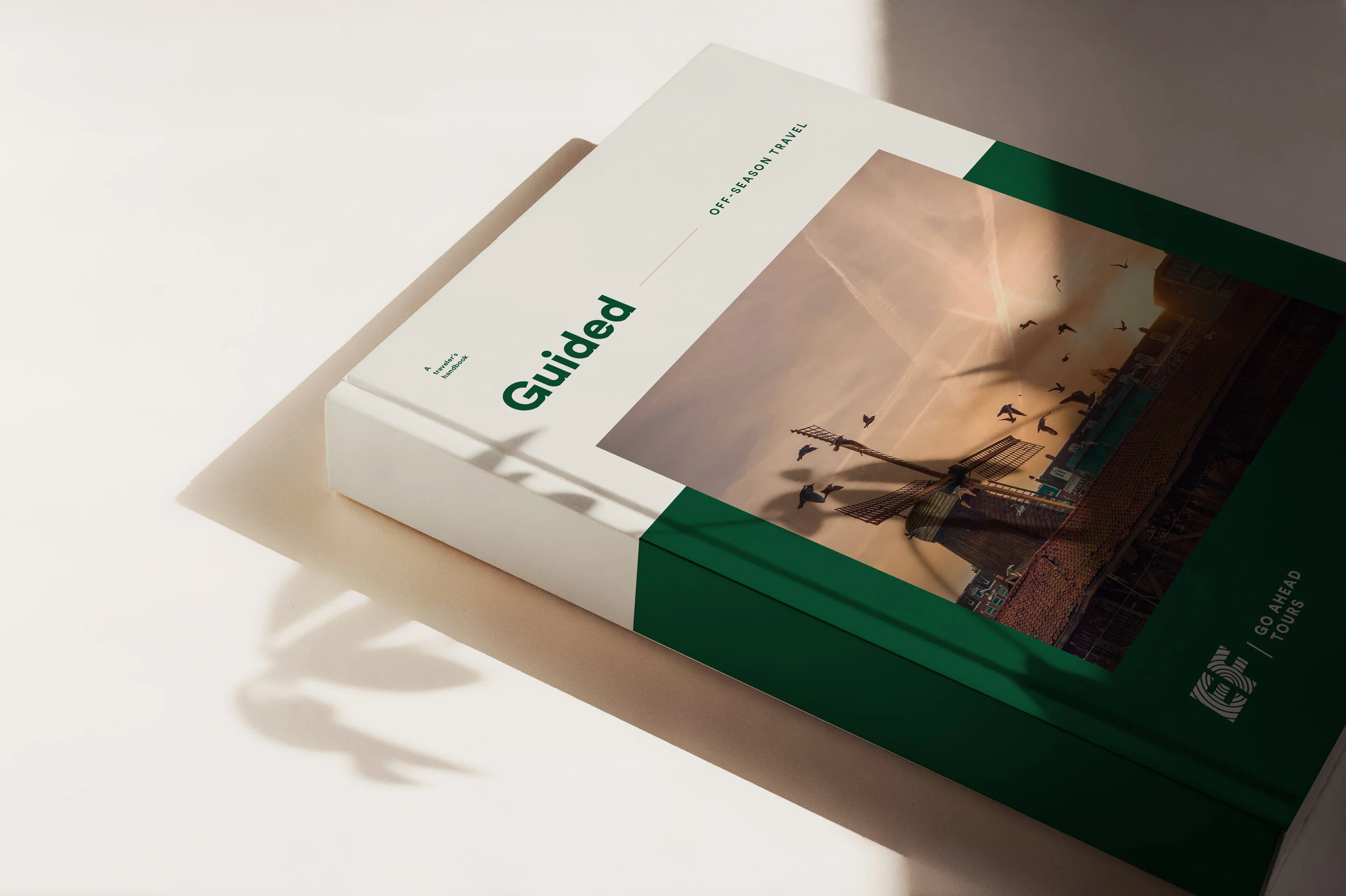
Guided
ROLE
Art Direction
Design
Naming
TEAM
Courtney Keller
Senior Copywriter
Laura Barber
Copywriter
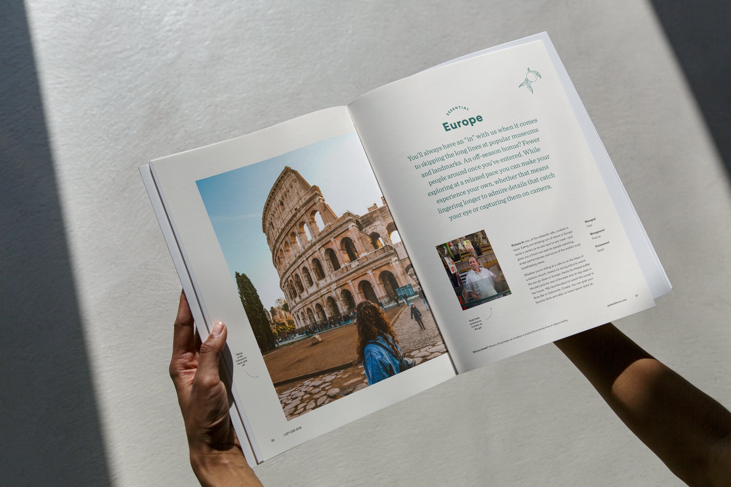
Print is not dead. We’ve found over the years that our marketing efforts convert more highly when we send a print piece in addition to digital marketing, so we’ve sought ways to better engage our print audience with both inspirational and shoppable content. The name Guided is a play on our core company offering—expertly crafted tours guided by experts.
Guided is a series dedicated to various travel topics such as off-season travel, food & wine adventures, and more. For the launch of this series, we went with Off-Season Travel, which was indicated as a major business opportunity for our company. If we could demystify off-season travel, we could potentially increase conversion for what is historically a low selling time to travel. Through this piece and the accompanying campaign, we did actually see a marked increase in off-season take rate.
Gift Guide
ROLE
Art Direction
Design
Animation
TEAM
Jamie Burke
Senior Copywriter
Christian Gilbert
Photographer
Brittany Duffy
Producer
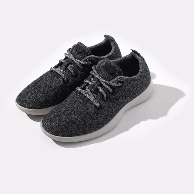
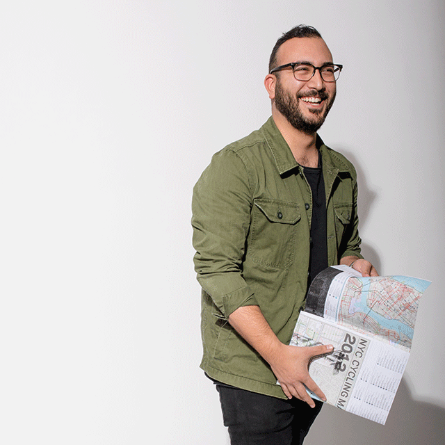
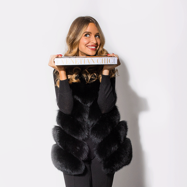
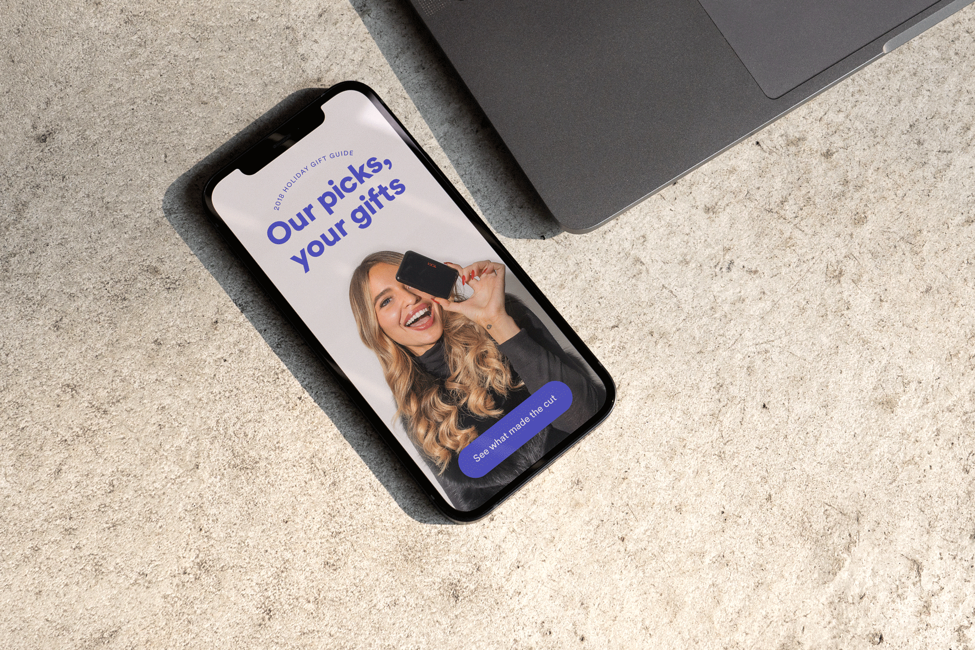
For our holiday editorial messaging, we crafted a gift guide composed of recommendations for our travelers from our jet-setting staffers. Wanting to convey the warmth and playfulness of some of the wonderful humans that make our wheel turn, we shot this in-house with staff photographer, Christian Gilbert, and me helming the art direction. Together with senior copywriter, Jamie Burke, we built out the assets for email, blog, and social channels, where they still live in earnest to this day.
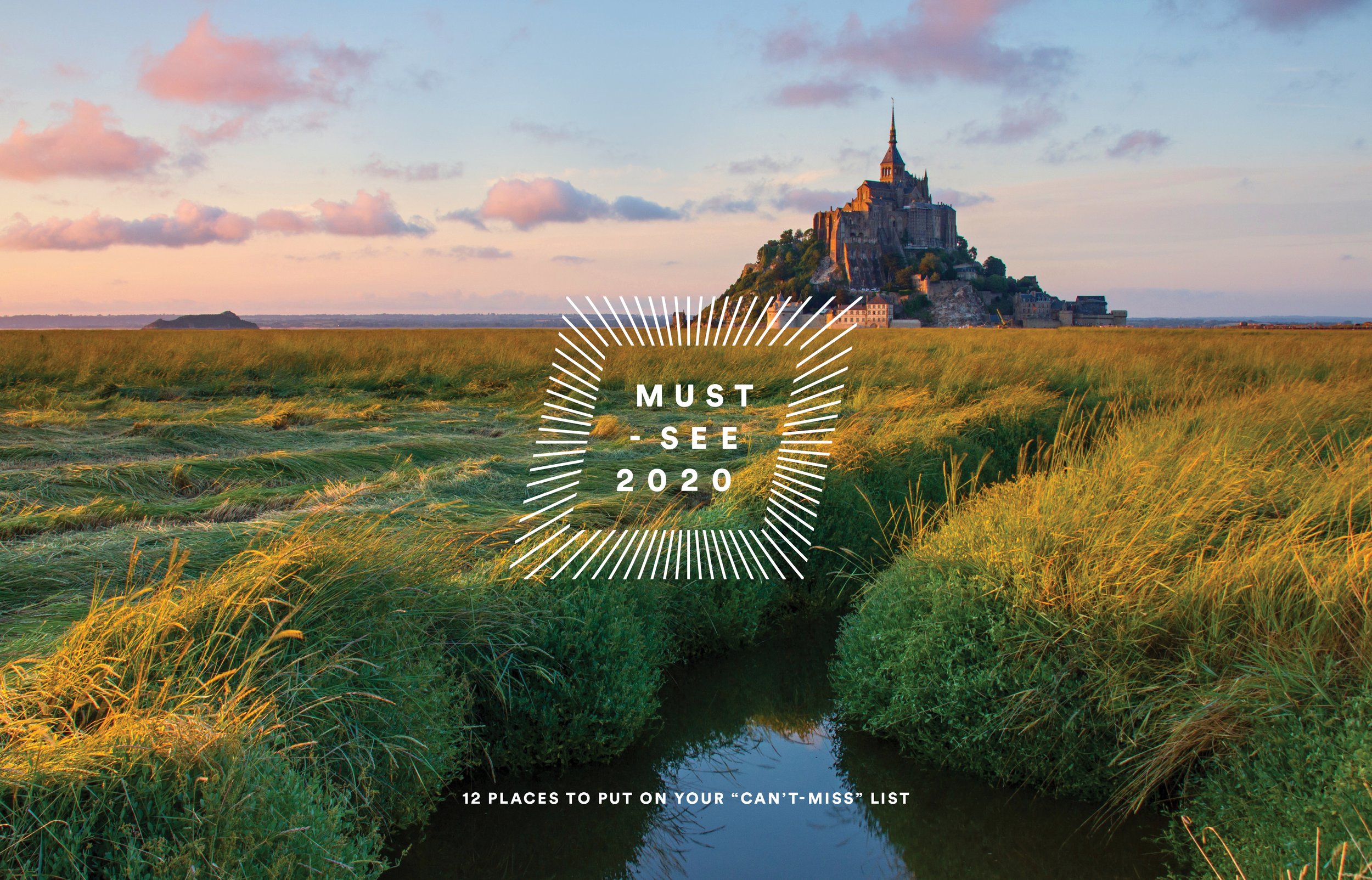
Must-See Campaign
ROLE
Art Direction
Design
TEAM
Jamie Burke
Senior Copywriter
Courtney Towson
Producer
Every year, working in tandem with our Market Innovation & Development team, we debut a collection of destinations designated as “Must-See’s” based on a variety of industry trends and projections. We create an integrated campaign—a print calendar, landing page, emails, paid and organic social content to support the campaign for the entire year.
We did pause the release of the campaign in 2020 because it felt tone-deaf to position these as must-sees given the state of the world. We instead pivoted our efforts to other content geared towards generating the feeling of travel and escape from the comfort of one’s own home.